Create a Canvas
Open Canvas
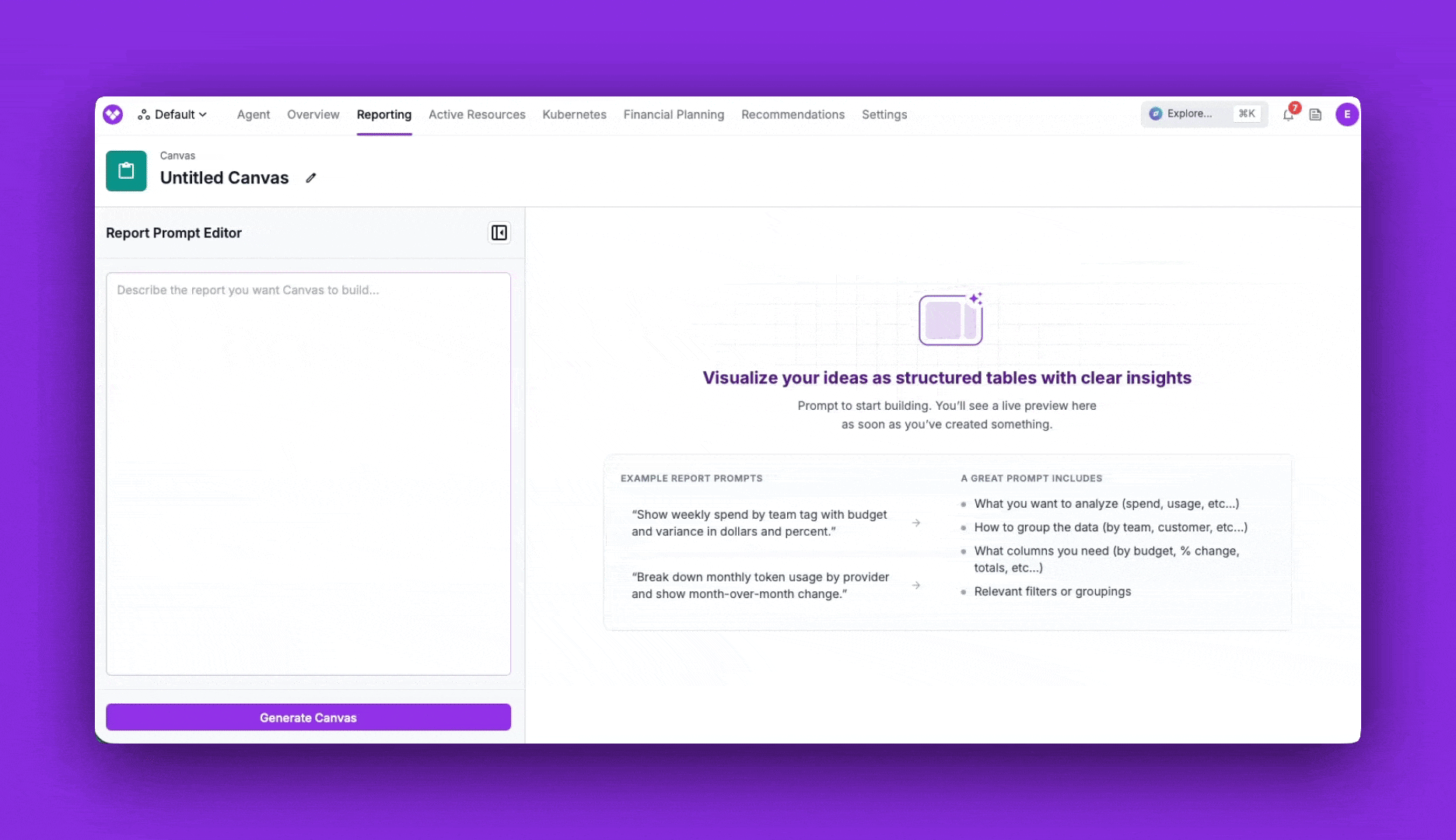
Describe the report you want
Show AWS spend for the last 6 months grouped by service. Add a column for each service's share of total spend, sort by spend descending, and include a total row.
Generate the report
Name and save it
- Edit the prompt: Open the prompt sidebar, change the text, and click Update Canvas to regenerate the table with your new instructions. Click Save to keep the updated prompt and table.
- Automatic daily refresh: Saved canvases refresh automatically once per day, so the data stays current without manual intervention. The last updated time is shown in the top-right corner.
Table Formatting
Vantage formats each column based on the type of data it contains:Sharing and Access
Canvas uses the same access model as your other Cost Reporting items:- Workspace and team access: When you save a Canvas, access follows the RBAC rules for the workspace, just like Cost Reports and dashboards.
- Manage Access per Canvas: Use the Manage Access option on a Canvas to grant or restrict access to specific teams, the same way you would for a report or dashboard.
Prompting Best Practices
Canvas prompts and FinOps Agent prompts share the same foundation: be clear about your Intent (what you want), Scope (which data), and Direction (how to present it). The FinOps AI Prompt Guide covers that framework in depth. The difference with Canvas is that the output is always a table, so the most useful prompts describe the table itself. When you describe a Canvas, think in terms of the table you want to see and include these details:Show AWS costs grouped by the department tag for May 2026. Include a previous-period comparison column for April 2026, plus computed columns for the dollar change and percentage change between periods. Sort by current-period spend descending and add a total row at the bottom.
- Rows/grouping: “grouped by the
departmenttag” - Columns/metrics: AWS cost for the current month
- Comparison period: “previous-period comparison column for April 2026”
- Computed columns: “dollar change and percentage change between periods”
- Sort and totals: “sort by current-period spend descending and add a total row”
- Formatting: Tell Canvas how to render a column—for example, “format currency rounded to the nearest thousand, like $100K” or “show the change as a percentage with one decimal.”
- Templates: Reference an existing Cost Report by token to reuse its filters and settings, for example, “use Cost Report
rprt_xyz789abc123def4as a template, keeping its filters but changing the date range to last month.”
Prompt Library
Copy any of these prompts as a starting point and replace the values in brackets (such as[workspace] or [time period]) with your own. Each one is written to produce a table.
Cost Breakdowns
Break spend down by service, account, region, or tag to see where the money goes.Show me my top 10 AWS costs by service over the last 6 months.
Break down last month's spend by provider and service in the [workspace] workspace. Sort by cost descending and add a total row.
Show spend by AWS account and region for [time period], sorted by cost descending.
Period Comparison and Variance
Compare two periods and compute the change in dollars and percent.Compare spend by service for this month vs. last month. Add columns for the dollar change and percentage change, sort by the largest increase, and include a total row.
Show weekly spend by team tag for the current week with a previous-week comparison column and the percentage change between them.
Budgets and Variance
Track actuals against targets to see what’s on- or off-track.Show weekly spend by team tag with budget and variance in dollars and percent.
For each team in the [workspace] workspace, show month-to-date spend, the monthly budget, the dollar variance, and the percent of budget used. Sort by percent of budget used descending.
Show rows from my department Virtual Tag values. Add columns for their weekly accrued costs, the corresponding budget with a header of "Target" instead of "Budget", then two computed columns for the difference in dollars and in percent.
Analyze AI spending across engineering teams. Compare actual spend against budget allocations, identify teams at risk of exceeding budget, and assign a Budget Health status to each team.
AI and Token Usage Efficiency
Track AI provider spend and usage to understand efficiency over time. If you’ve configured a Business Metric such as Linear requests completed or Jira tickets closed, you can divide AI spend by it to compute a per-unit cost.Break down monthly token usage by provider and show month-over-month change.
Show AI provider spend by model for the last 3 months, with a column for cost per million tokens. Sort by spend descending.
Show my top 10 developers by Cursor spend over the last 3 months. Using my "Linear Requests Completed" Business Metric, add a per-unit cost column for spend per completed request and sort by it, lowest cost first.
Team and Department Showback
Allocate spend across teams or departments for showback and chargeback.Show last month's spend grouped by tag:team, sorted by cost descending, with each team's share of total as a percentage column.
Show spend by department for the current quarter with a previous-quarter comparison column and the percentage change.
Show all of my customers Virtual Tag values and their spend as a percent of our total spend, month over month.
Unit Economics and Business Metrics
Combine Vantage cost data with an existing Business Metric to compute unit costs or compare spend against business outcomes. If you import revenue and usage from Metronome, reference the Metronome-backed business metric by name and pair it with the Cost Report that represents the cost you want to analyze.Show monthly total spend for the last 6 months. Use my "Revenue" Business Metric and add a column for cost as a percentage of revenue.
Using my "COGS" Cost Report and the "Metronome Virtual Machine Hours" business metric, calculate cost per VM hour by customer for the last 30 days. Include total COGS, total VM hours, cost per VM hour, and rank customers by total COGS.
Compare "Metronome Revenue" to my "COGS" Cost Report for the last month. Group by customer label and include revenue, COGS, gross margin dollars, and gross margin percent.
Show monthly infrastructure spend per customer for the last 6 months using my "Active Customers" Business Metric. Include the cost-per-customer column and the month-over-month change.
Compare infrastructure spend against my "Product Growth" Business Metric across engineering initiatives. Identify which products are scaling efficiently and assign a Scaling Health status.
Trends Over Time
Build a time series to see how spend moves day over day or month over month.Show daily total spend for the last 30 days as a two-column table of date and cost.
Show monthly spend by service for the last 6 months with a column for each month, so I can scan the trend across the row.
Verify Your Results
Canvas generates tables from your prompt, so small wording changes can change the output. If a table does not look right, use the checks below to validate the data and refine your prompt.- Compare the scope: If a total is different from what you expected, compare the Canvas prompt against an existing Cost Report and make sure both use the same workspace, filters, date range, and cost settings.
- Check how derived columns are defined: For columns like variance or percentage change, confirm that the prompt clearly states which columns or periods should be compared.
- Refine and re-run: If the table does not match your intent, make the prompt more explicit: name the exact metric, period, grouping, and calculation you want, then regenerate the Canvas.
Troubleshooting
If a Canvas doesn’t behave as expected, use the table below to identify the cause and resolution.Frequently Asked Questions
How is Canvas different from a Cost Report?
How is Canvas different from a Cost Report?
How is Canvas different from the FinOps Agent?
How is Canvas different from the FinOps Agent?
Can Canvas change my data or take actions?
Can Canvas change my data or take actions?
How fresh is the data, and how does refresh work?
How fresh is the data, and how does refresh work?
Who can see my Canvas?
Who can see my Canvas?
What data can Canvas use?
What data can Canvas use?
Are Canvas changes audit-logged?
Are Canvas changes audit-logged?
Can I export a Canvas, or add it to a Dashboard?
Can I export a Canvas, or add it to a Dashboard?